Golem Redesign.
Making an information overload accessible.
During my studies I had the pleasure to work with the editor in chief of Germany's biggest tech news website.
Making an information overload accessible.
During my studies I had the pleasure to work with the editor in chief of Germany's biggest tech news website.
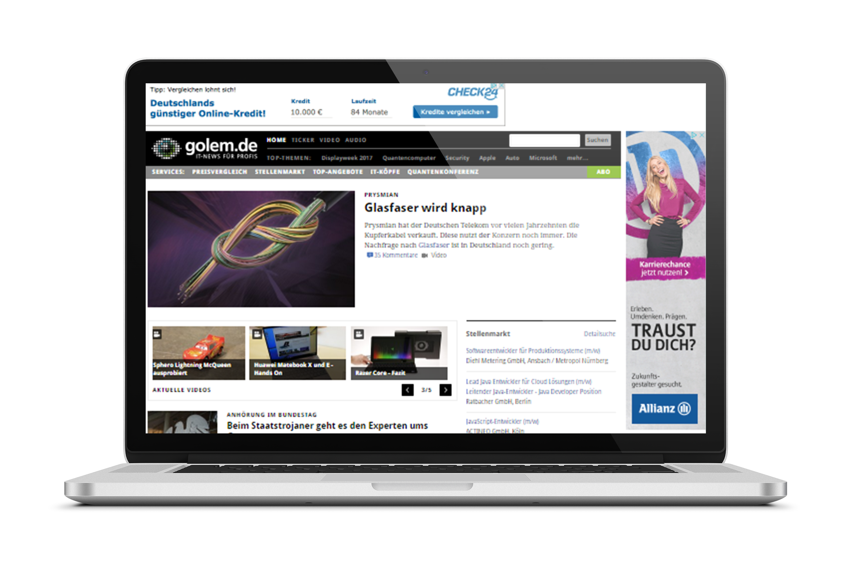
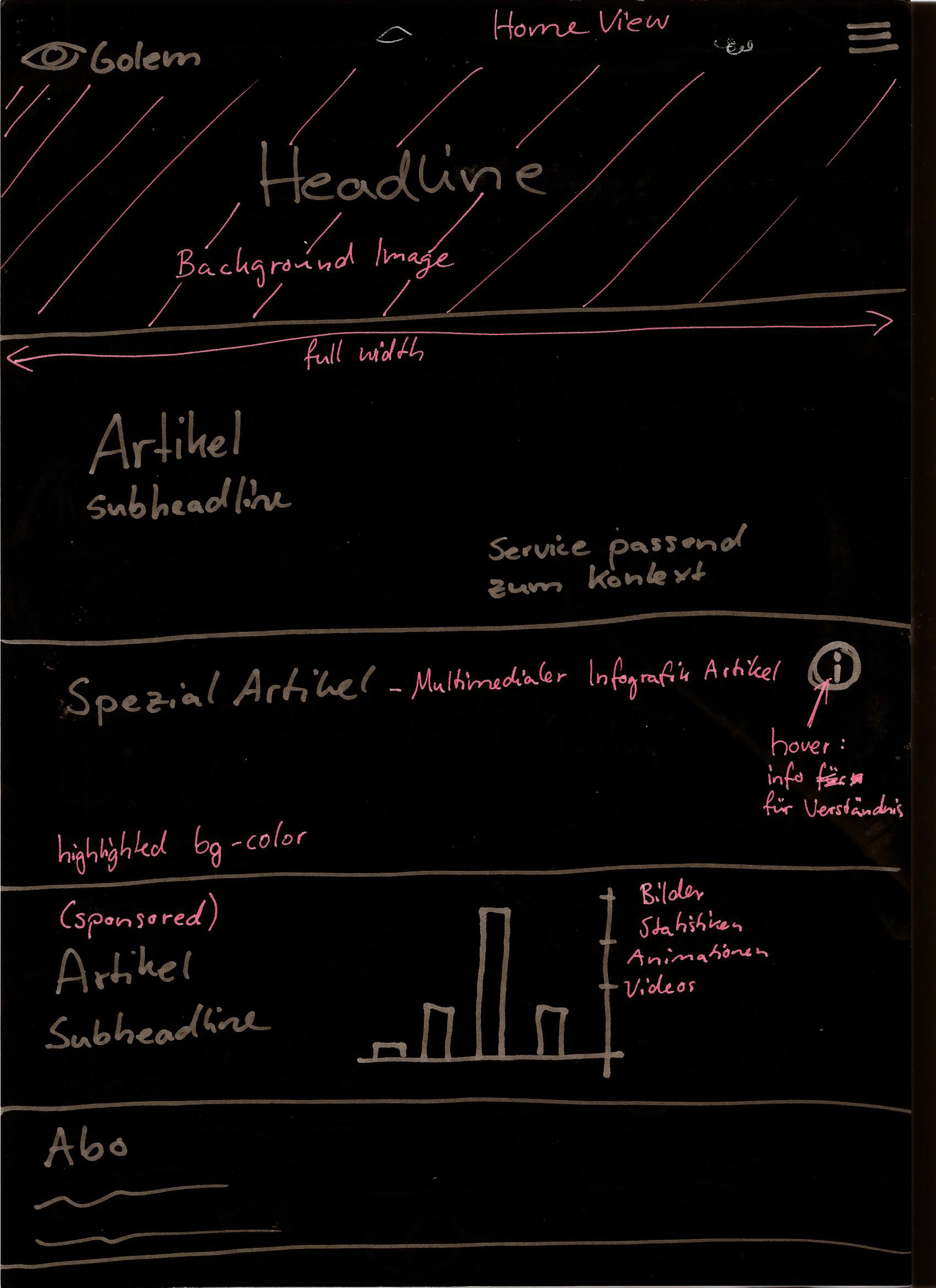
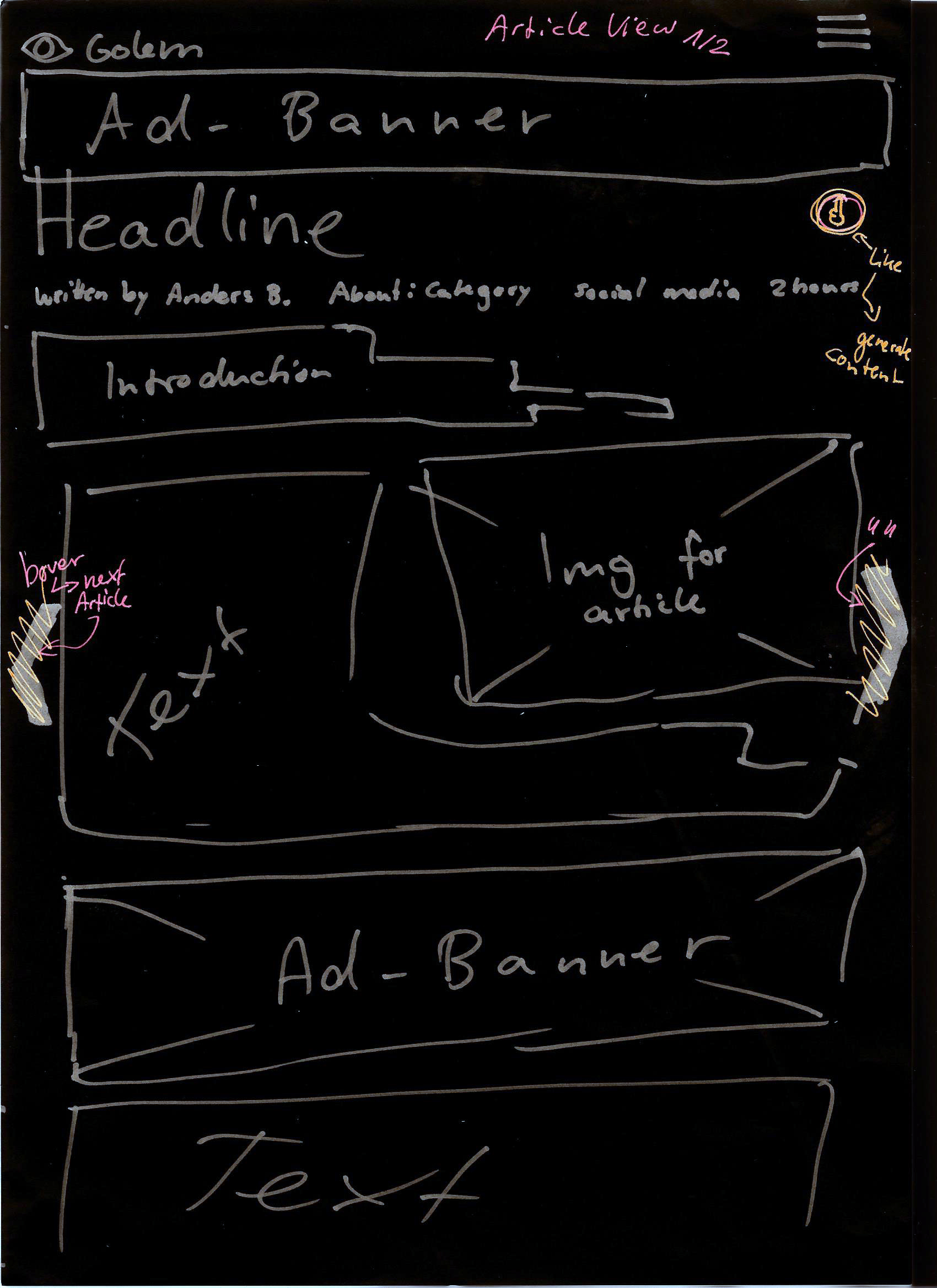
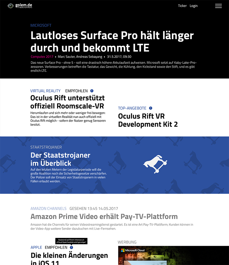
Due to Golem being a 20 years old news website, the UI has grown to a point where the user may feel overwhelmed with the information. There is no clear visual hierarchy, the navigation got more and more complex and the brand "Golem" is not prominent enough.
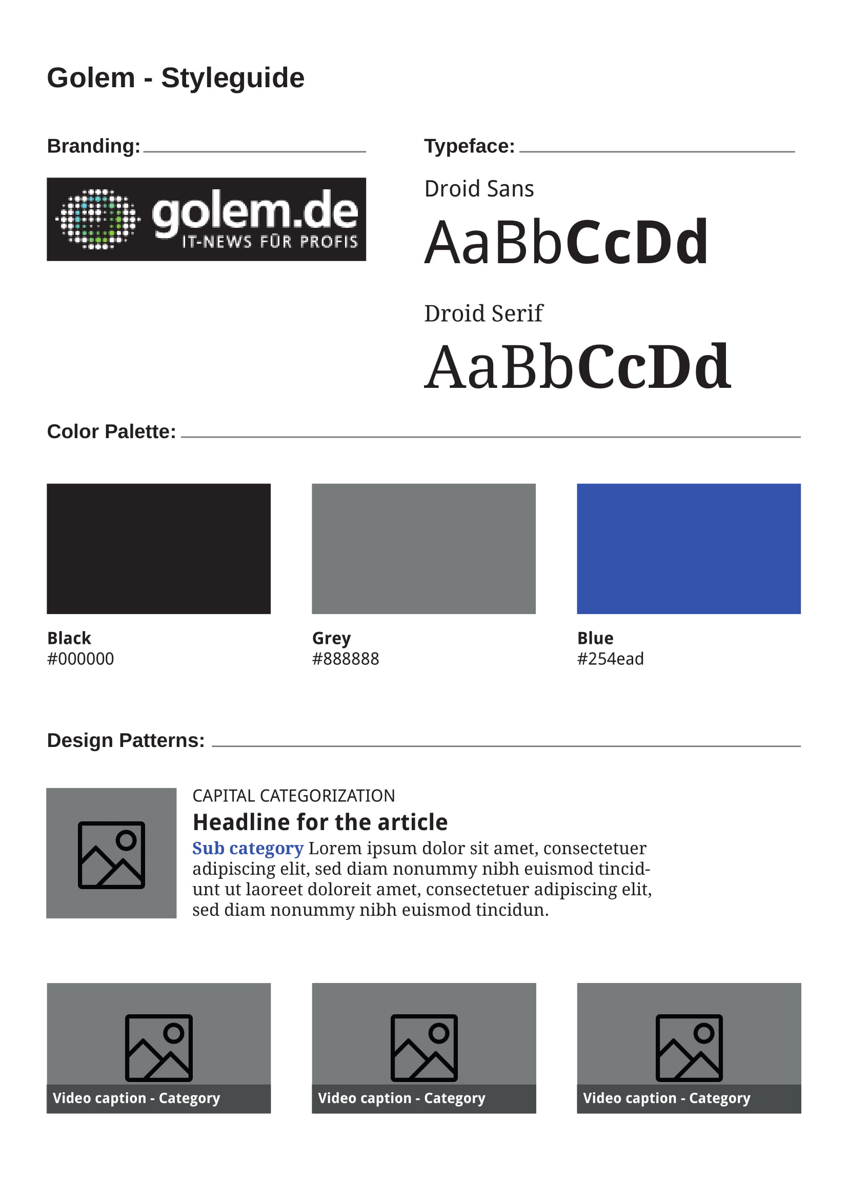
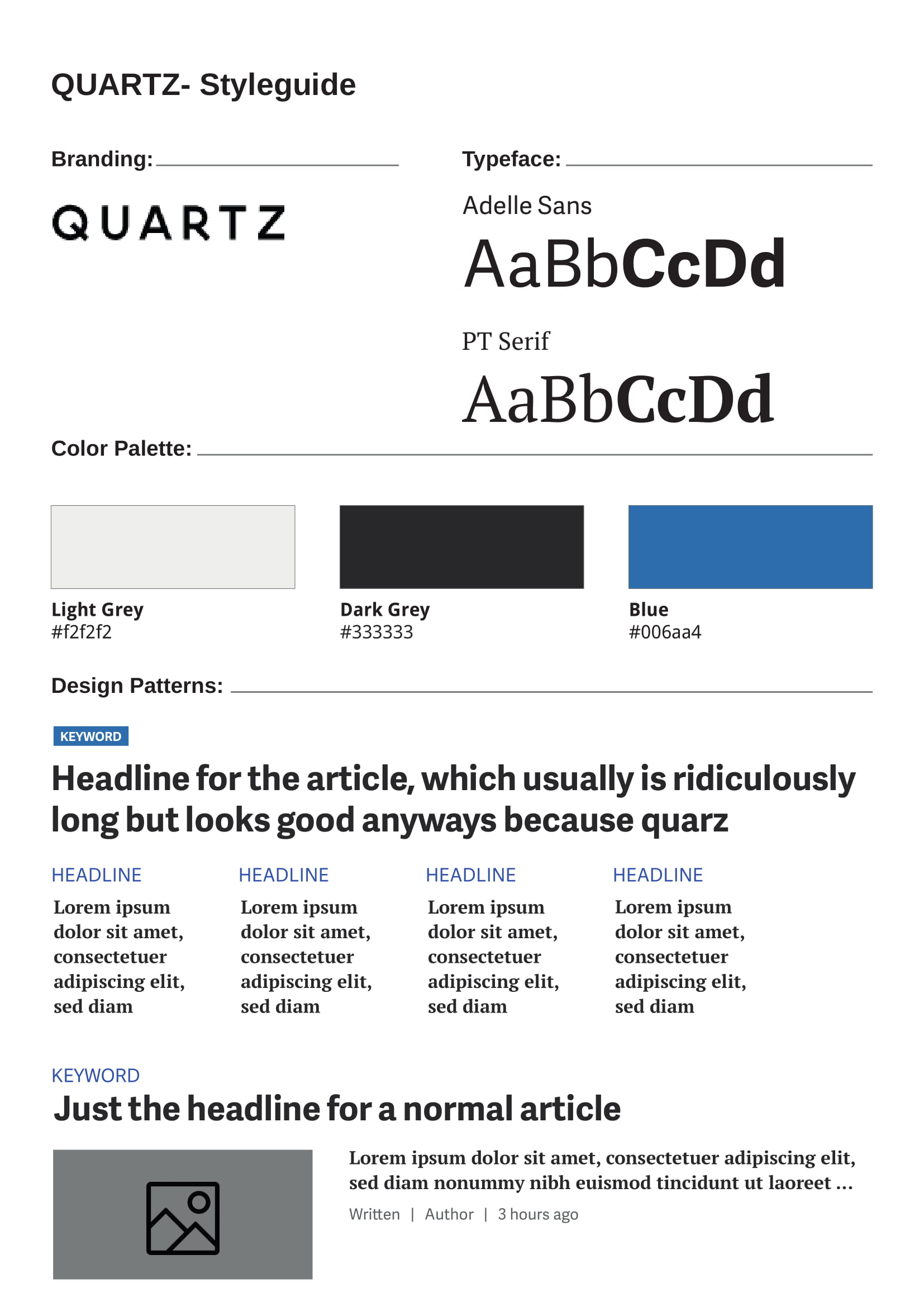
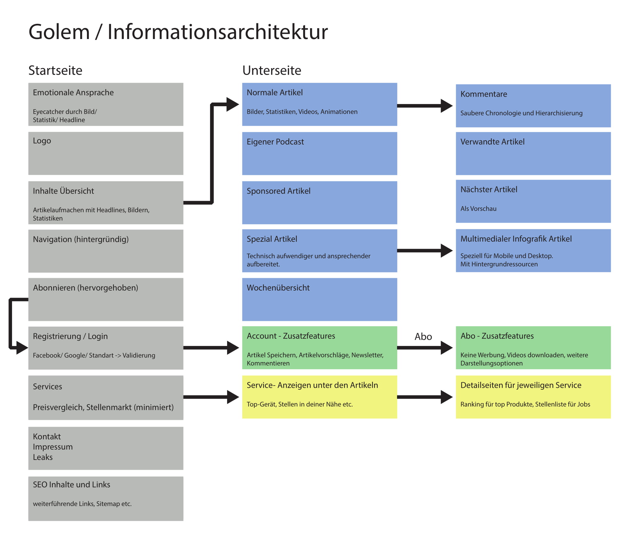
After analyzing common UI elements of Golem and collecting them in a stylesheet for better comparison I started looking for positive benchmarks. I found qz.com to be a good example of a news website which managed to lead it's users smoothly through the experience. Additionally in order to wrap my head around the complex data infrastructure I mapped the information architecture.
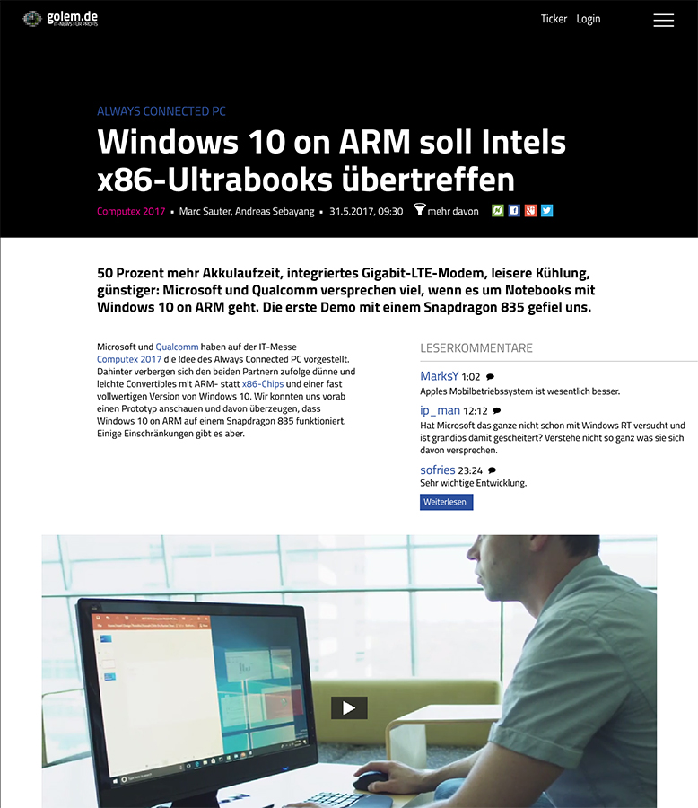
To make the user journey more clear and directional I stripped most of the UI elements away. Advertisement and other services are bound to contextually relevant articles and the news feed is multimedial and less categorized.
After I finished creating the screen designs I started developing using HTML, CSS and Javascript.
For presentation purposes the finished solution was recorded to show the website in action. A voice overlay tells about the features and changes.